# Campaign Management tool for busy brands
By Vandan Gohil · Role: Founding Product Designer, 2023 · Scope: Product Design, Research, Design Systems · Industry: Creator Economy, B2B SaaS
October 6, 2026 · Two-Sided Products
Revamped the SaaS workflow, cutting manual work by 40% and enabling brands to launch 3x more campaigns with less friction.
[Case study](https://vandangohil.com/creatorx)## At a glance
- Product: CreatorX (launched as HypdVision), CultureX's platform for running influencer campaigns between brands and creators.
- Role: Founding Product Designer, sole designer. Owned research, product design and the V-Flux design system, from research to shipped MVP in three months.
- Team: Vinay Mehta (CEO), Shubham Jain (PM), Dipesh Jaiswal (lead developer), Ashish Patel (developer).
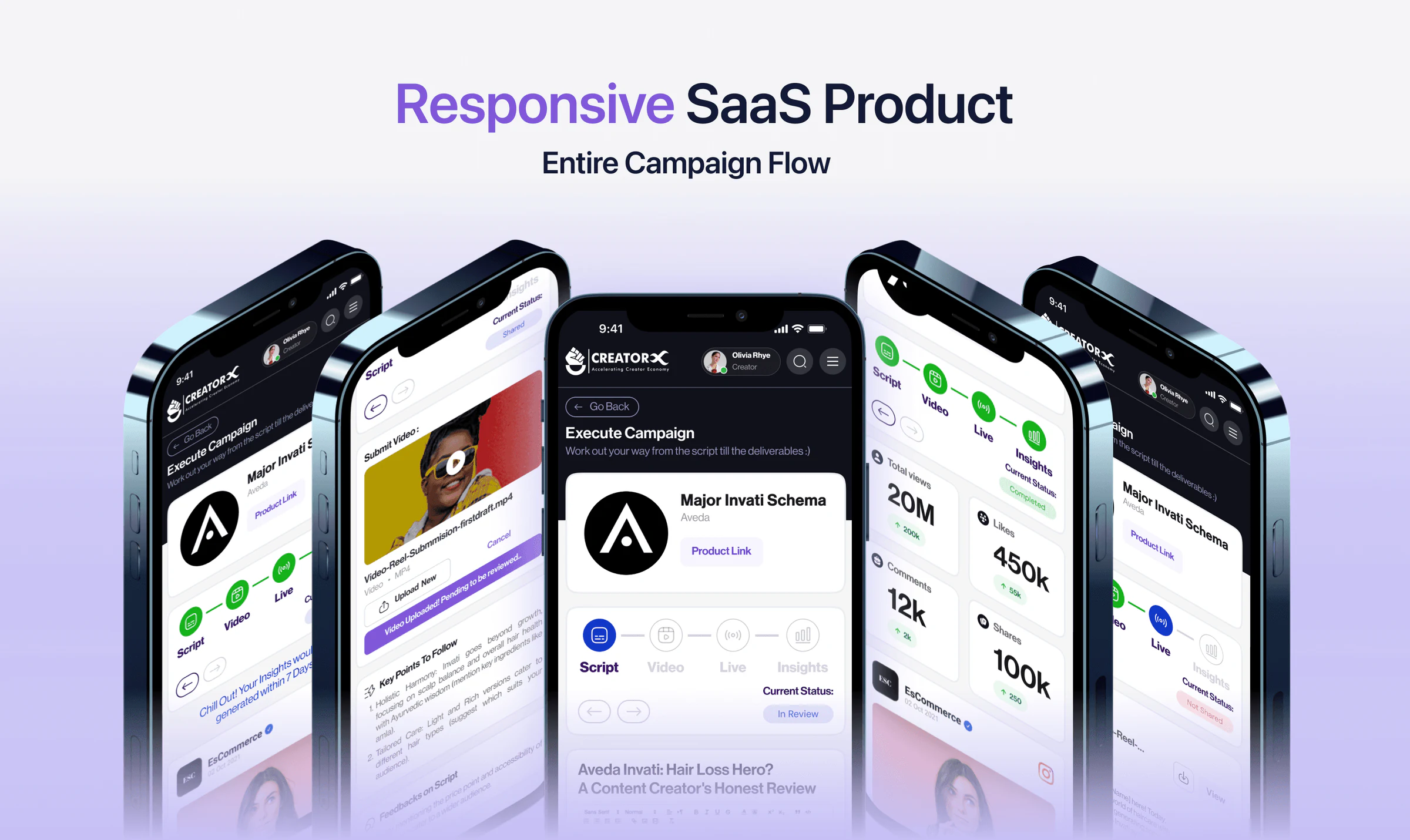
- Key insight: I assumed creators run campaigns from their phones; a survey of 30 (and five interviews) found 20 run them from a laptop, so the product was built desktop first, then responsive.
- Surfaces: Global Search (25+ filters) for discovery, a segmented campaign page with a next-step status bar, and a campaign overview for brands.
- Impact: time to discover creators down 75% (2h → 30 min); drafting deliverables down 63% (4h → 1.5h); brand review down 50% (4h → 2h); brands 21× more productive (12 → 251 brands, 40 → 128 campaigns).
## Context
In 2023, an influencer campaign at CultureX ran on WhatsApp. Briefs went out as messages, scripts came back as Google Docs, videos as Drive links, and feedback as calls. Every campaign got done. None of them scaled.
A brand running twenty creators was running twenty threads, each at a different step: one waiting on a script, one on a reshoot, one gone quiet. Nobody, brand or creator, could see the whole campaign at once.
CultureX wanted to take the business online. You can't scale a workflow that lives in DMs.
I was the only product designer, from research to a shipped MVP in three months. The platform grew to 250+ brands. This is how it got there.
The mission we built toward: A creator should know their next step without chasing a brand manager for it, and hand in a deliverable without opening three different apps to do it.
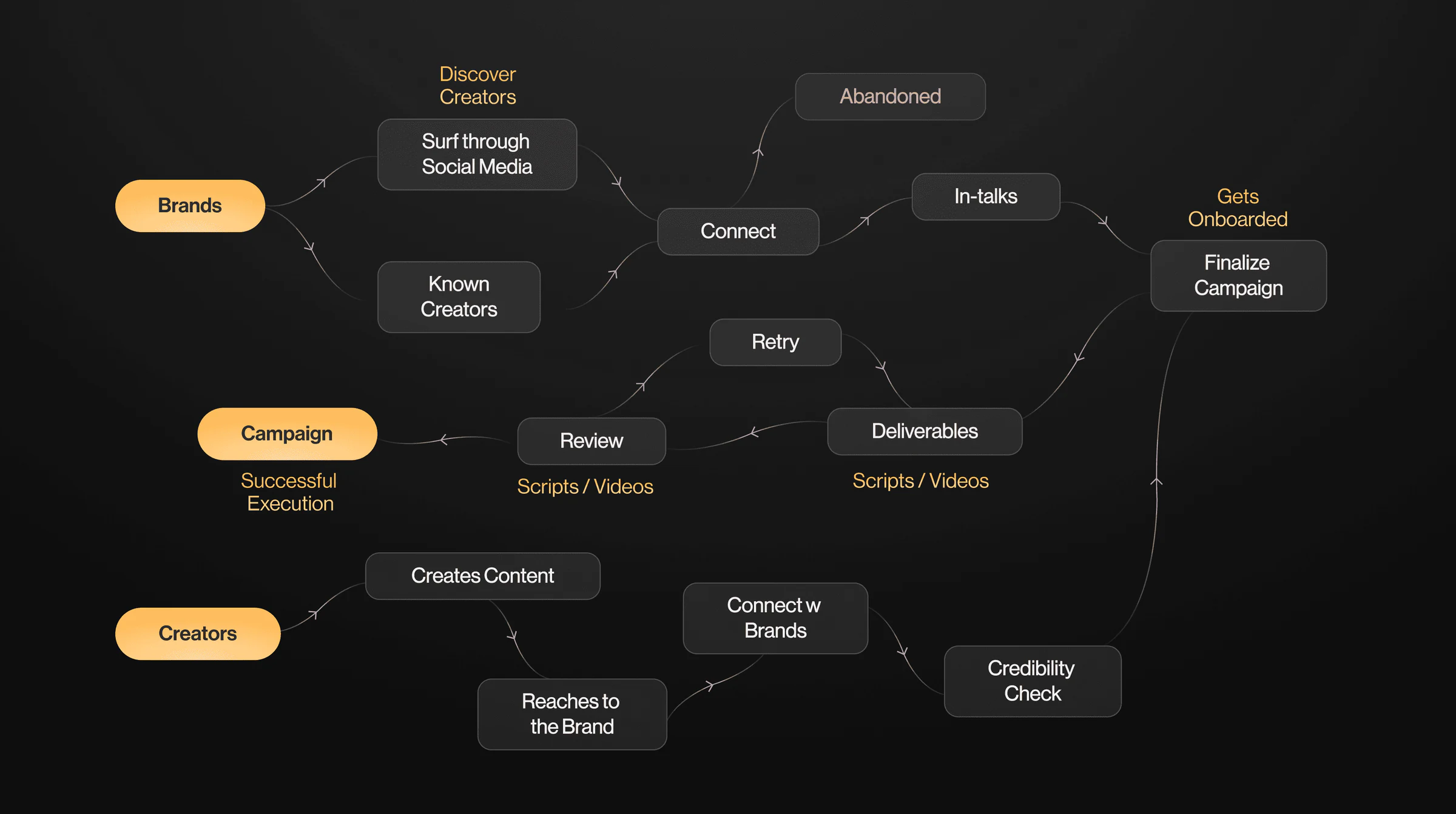
[Image: How a campaign ran before] The campaign flow before the platform: brands find creators by scrolling social media or going back to ones they know, connect, and either lose them or finalize; creators reach out and pass a credibility check; deliverables loop through review and retry until the campaign goes out.
[Image](https://vandangohil.com/studies/creatorx/current-flow.webp)## What was wrong
I started by mapping how a campaign actually moved, from the brand's first search to the final report. Working through it with the CultureX team and brand reps, the same three leaks kept coming up.
- Brands ran campaigns across too many apps. Every brief, file and reply landed in a different app. Nothing was the source of truth, so every round started with: which version is this?
- Discovering creators took hours. Brands spent hours on Instagram profiles to find the right influencer.
- Campaigns at scale were hard to manage. Every new creator added a thread. Past a dozen, nobody knew who was on which step.
Where AI was used:
Today I'd start the way Reports started: record the kickoff with the founders, mine the transcript for intent, then run agents in parallel on how campaign platforms structure the work and what brands and creators complain about in reviews.
The map itself I'd still draw by hand. It came from watching people work, and that's the part an agent doesn't see.
## Three user groups in every campaign
Every campaign brings together three kinds of users, and each needs something different from the same page.
[Reader cards, one per user type]
- Brands. Cares about visibility: Is every creator moving, and which one is stuck?
- Creators. Cares about the next step: The brief, the script, the feedback and the deadline, in one place.
- CultureX team. Cares about throughput: Onboard both sides, unblock deliverables, close out every report.
My assumption was that creators were the core of the product. They execute the campaigns and live on Instagram, so I expected them to run campaigns from their phones. To test that, I interviewed five creators and surveyed thirty.
[Survey] What device do you use for campaigns?
20 of 30 creators run their campaigns from a laptop.
- Laptop: 20 of 30
- Phone: 6 of 30
- Both: 4 of 30
Count the four who use both, and 24 of 30 work from a laptop.
I was wrong. Two in three run campaigns from a laptop, where their scripts, files and edits already live. So the product had to be desktop first, then responsive, not the other way round.
What both sides were really asking for: One place where everyone can see where a campaign stands, and what has to happen next.
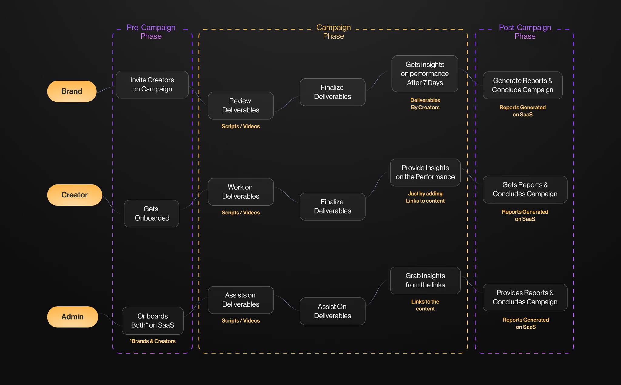
[Image: The redrawn campaign flow, in three phases] The redrawn campaign flow for brand, creator and admin across three phases: pre-campaign (invite and onboard), campaign (work on, review and finalize scripts and videos, then insights after seven days), and post-campaign (reports generated on the platform).
[Image](https://vandangohil.com/projects/hypdvision/campaign-flow.avif)But before a campaign can have a state, it needs creators, and that is where brands lost the most time. So the first thing we built was creator discovery.
## Solution 1: Global Search for creator discovery
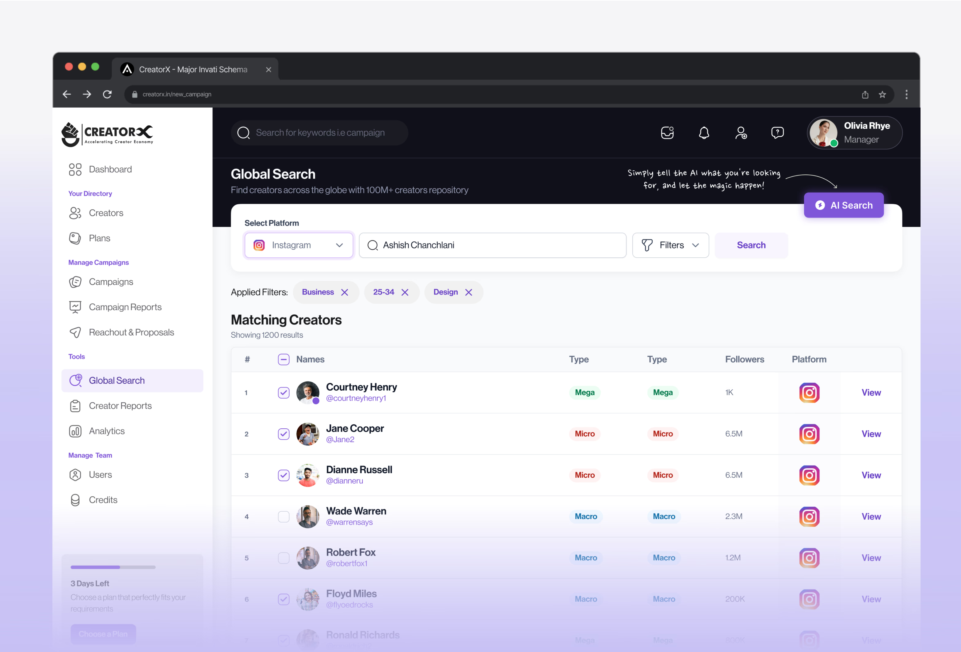
Global Search is a catalogue of every creator on the platform, filtered down to the brief.
The filters were the product. They decide whether search beats scrolling Instagram or just becomes another place to scroll, so most of the research time went into which ones brands actually reach for.
[Image] The Advanced filters panel: influencer, audience and previous-filter tabs; selected filters as chips; sliders for age, followers and reel plays; engagement rate, gender, language, location, and free-text bio and keyword fields.
[Image](https://vandangohil.com/studies/creatorx/advanced-filters.webp)- Filters for the creator and their audience: More than 25: age, followers, reel plays, engagement rate, language, location, even a line remembered from a creator's bio.
- Every category counts: Most creators sit across several niches. Filters take many values at once, as chips you can remove, so a brief gets as narrow as the brand needs.
- Previous filters: Brands kept rebuilding the same search for every campaign. A tab of previous filters brings the last brief back in one click.
The shortlist then goes straight into the campaign: select creators, add them, and the invitations go out from the same screen. Finding creators dropped from about two hours to thirty minutes.
## Solution 2: Campaign management on one page
The campaign page is where both sides spend their time, and it carries a lot: the brief, the product, the brand's key points, the script, the video, the live post, the numbers after it, and every round of feedback.
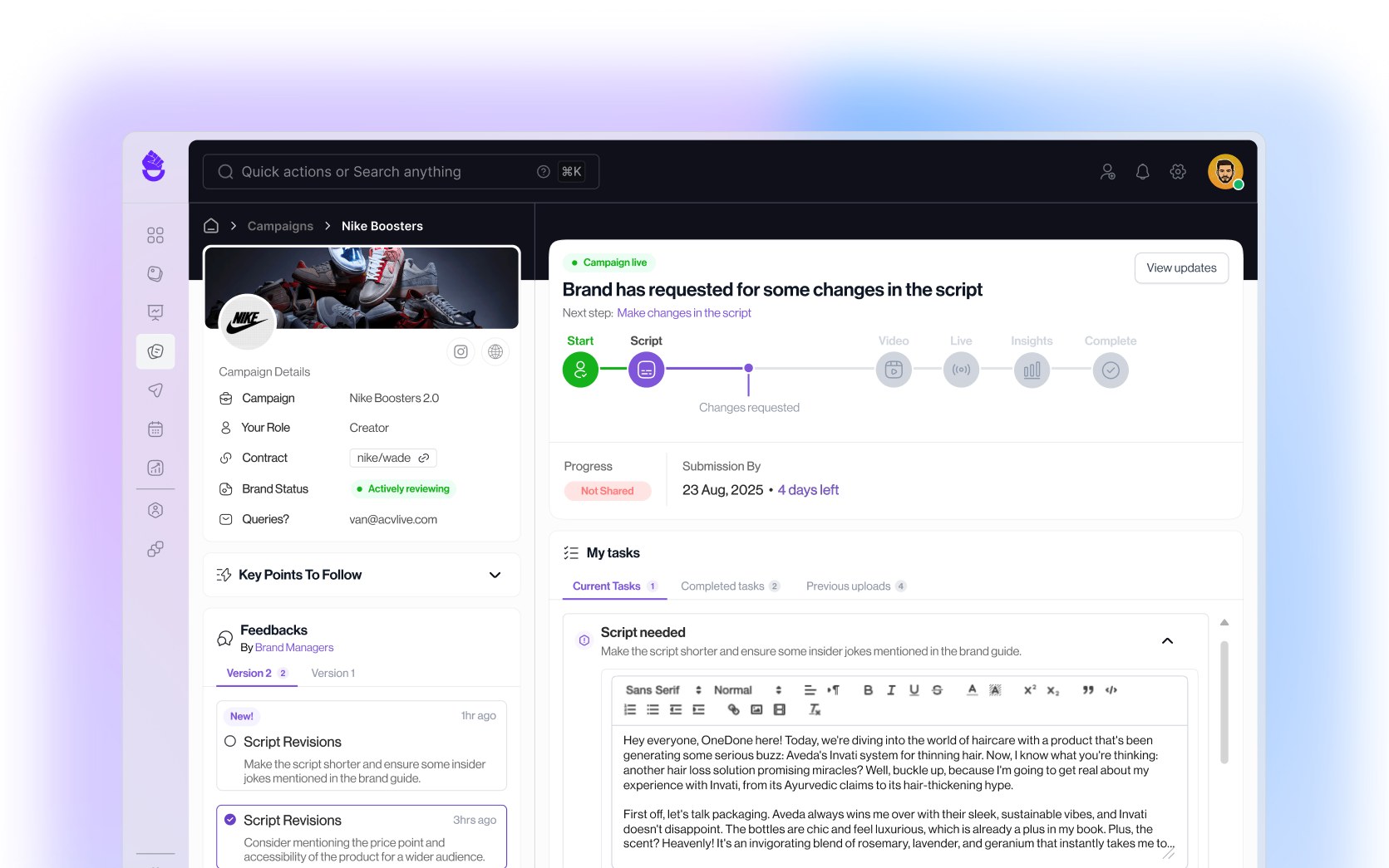
[Interactive figure] The campaign page in CreatorX for Nike Boosters 2.0, from the creator's side. Its segments:
1. Status: Where the campaign is, and the next step, in words.
2. My tasks: Where the work happens: write the script, upload the video, post live, attach insights.
3. Campaign details: Product, role, contract, and whether the brand is reviewing right now.
4. Key points: What the brand needs mentioned, one tap from the script.
5. Feedback: Every round from brand managers, versioned, each marked done when it's handled.
[Image](https://vandangohil.com/studies/creatorx/hero.webp)The status bar carries the page's most useful decision. It doesn't only show where the campaign is; it says what happens next, in a sentence. A progress bar that only shows position is a receipt. One that names the next step is a to-do.
[Interactive figure] The campaign status bar, played through one campaign from the creator's side: each state names what happened, the next step and the deadline, including a script sent back for changes, a video due today and the finish.
Creator view:
- Script (Script due): You're in. Time to write the script. Next step: Draft the script. Progress: Not shared. Submission by: 18 Aug, 2025, 6 days left.
- Script (Script submitted): Script sent. The brand is reviewing it. Next step: Wait for the brand's feedback. Progress: Shared. Submission by: 18 Aug, 2025, 5 days left.
- Script (Changes requested): Brand has requested some changes in the script. Next step: Make changes in the script. Progress: Not shared. Submission by: 18 Aug, 2025, 4 days left. Edge case: Retry: changes requested.
- Script (Revision submitted): Revised script sent. Round two. Next step: Wait for the brand's feedback. Progress: Shared. Submission by: 18 Aug, 2025, 3 days left.
- Video (Upload the video): Brand has approved the script, let's work on the video. Next step: Upload the video. Progress: Not shared. Submission by: 23 Aug, 2025, 4 days left.
- Video (Due today): The video is due today. Next step: Upload the video. Progress: Not shared. Submission by: 23 Aug, 2025, Due today. Edge case: Deadline: due today.
- Video (Video submitted): Sit back and relax, the video has been uploaded. Next step: Wait for the brand's feedback. Progress: Shared. Submission by: 23 Aug, 2025, Submitted on time.
- Live (Deliverable pending): Brand has approved the video, let's make it live!. Next step: Post it and add the link. Progress: Not shared. Submission by: 25 Aug, 2025, 2 days left.
- Insights (Insights in 7 days): You're live. Insights unlock in a week. Next step: Attach your insights after 7 days. Progress: Shared. Submission by: 1 Sep, 2025, 7 days left.
- Complete: Campaign complete. Nicely done. Next step: Download your report. Progress: Complete. Submission by: 1 Sep, 2025, Closed.
## Managing big campaigns
On a big campaign, the counts slip first. The Campaign Overview gives brand managers four numbers (scripts completed, videos in review, deliverables live, insights received) and a week of activity, so they see what's stuck before anyone asks.
## A/B testing
Where AI was used: none here. Sixteen iterations, eight interviews, and an order that came from creators telling us what they open first. This part was people.
A third of creators also work from a phone, where the segments can't sit side by side, so their order is the design. I A/B tested sixteen mobile iterations with eight creators. The order that won follows the creator's own questions, top to bottom.
## System that builds
Three months, two developers, one designer. What held it together was a shared vocabulary between design and engineering, agreed before the first screen.
That vocabulary was V-Flux, the design system I made, interactions included: 90+ reusable patterns the developers built against.
Where AI was used:
Today V-Flux would ship with a design.md beside it: the same system, written for agents to build against. That's what took Reports from a brief to six live reports in two weeks.
With build no longer the long pole, the time it frees goes where this project needed it most: working screens in front of creators in week one, not at release.
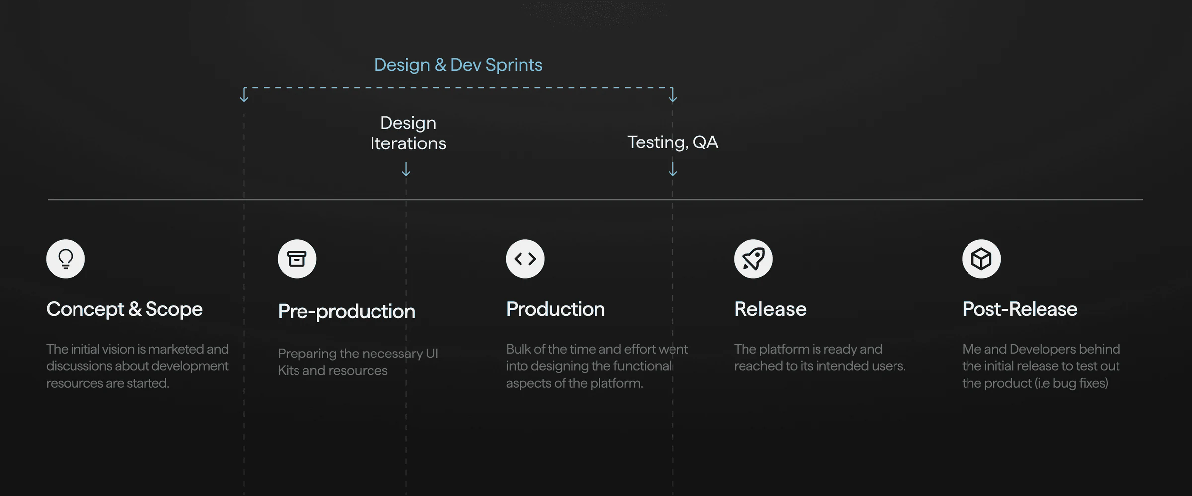
Stage | What I did | How I'd do it today
Concept and scope | Research workshop, the map of the old flow, the MVP boundary | Kickoff transcript mined for intent; agents on competing platforms and their reviews
Pre-production | Built V-Flux and the UI kit the developers built against | V-Flux written as design.md, for agents to build against
Production | Global Search, the campaign page and the overview, in sprints with the developers | Front end generated against the system; my time on hierarchy and states
Mobile | Sixteen iterations, A/B tested with eight creators | None. This part was people
Release and after | Shipped the MVP, then tested and fixed bugs with the developers | The same, with the funnel instrumented from day one
## Impact
The problem was hours lost, so impact is measured in hours won back: time on the same tasks, before the platform and after it. I followed up with the CultureX managers for these numbers.
The MVP was presented at a company all-hands, and it landed well.
[Outcome cards]
- Discovering creators: 75% time reduced. Global Search's 25+ filters replaced hours on Instagram profiles.
- Drafting deliverables: 63% time reduced. The brief, key points and script editor sit on one page.
- Brands reviewing deliverables: 50% time reduced. Versioned feedback ended the which-version question.
- Brands running campaigns: 21× more productive. Brands 12 to 251. Campaigns 40 to 128. With the hours back, brands run far more campaigns in the same time.
## What I'd take into the next one
## Test the assumption before designing for it
I was sure creators ran campaigns from their phones, and a phone-first product would have followed. Five interviews and a thirty-person survey said laptop. A small round of research kept us from building for the wrong screen.
## A tight timeline forces the real question
Three months left no room to design everything, so every screen had to answer one question for one person. That constraint is the reason the campaign page has segments at all.
## Impact is the measure, not polish
Success isn't how easy the product feels or how good it looks. It's how well it solves the problem, and how big that change is. I went back to the managers for the KPIs, and those numbers are how I judge whether this product worked.
## How this page is designed
- Layout: the shared case-study platform. A 628px reading column with figures bleeding to 788px, a sticky scroll-spy table of contents on desktop and a section dial on phones, 40px above each heading, 12px to its first paragraph, 16/24 body text.
- Palette: the charts and new visuals take the four pastels of the CreatorX Campaign Overview (green, blue, yellow, purple), each paired with a deep ink of the same hue for numbers and labels; stone is the neutral and 'before'.
- AI layer: a 'See how I'd build it today' switch. The project predates agents in my process, so the layer is labelled hindsight and draws on how Reports was built. Passages write themselves in word by word in the iridescent AI gradient.
- Old way: a lead card and two beneath it, one per problem, each a live scene telling its story, all at once: notifications from six apps arriving one by one into a stack that folds and resizes as the unread count climbs; creator profiles judged one at a time (mostly skipped) until two hours buy three names; and a campaign list that grows from three creators to two dozen, zooming out to fit while its oldest rows go dark.
- Reader cards: the three sides of a campaign drawn as isometric Hairline figures (an office tower for brands, a phone on a tripod with posts rising for creators, a hub bridging the two for the CultureX team) that animate at rest and answer the pointer.
- Device survey: the leading count as the headline, then one stacked bar of all thirty answers with the phone share as the only accent and the 'both' group hatched; palette checked with a colour-vision validator.
- Screens: the campaign page's five segments are spotlighted in turn, with a callout pinned beside the active one and a step bar beneath; the filter panel is an accordion whose open item spotlights its part of the screen.
- Impact: four cards, three to the first row and productivity across the second, each led by its number and a plain-language label of what it measures. Each chart replays its change: the after bar starts level with the before bar and travels to its value while a dashed connector follows it and the absolute difference settles on the line.
- Accessibility and performance: reduced motion is respected throughout; every interactive figure has its meaning in text for assistive tech and in the machine view; screenshots are near-lossless WebP sized to their display.
## Pages
## Contact
## Archive